5 Things to Do in Little Tokyo, California
Never been before? We’ll be your trustee Little Tokyo guide with a day’s worth of fun things to do in Little Tokyo.
The first day of fall has finally arrived. Get ready for the season with some pumpkin spice lattes and our seasonal Pantone color guide.
While we have been spoiled with pumpkin spice lattes as we anxiously await the arrival of fall, the beloved season is upon us. For some, autumn is marked by end-of-summer parties that mourn the season’s passing, while for others, the season is embraced with open arms, cozy blankets, and as many pumpkin products as humanly possible. We fall into the latter category—we’re eager to look up the Pantone colors for fall and winter 2021/2022. Showcasing the standout colors from New York and London Fashion Week, these reports serve as great sources of inspiration for your own autumn palette, whether that’s in fashion, home decor, or anything else!
This year, the fall equinox takes place on September 22 at about 12:20 p.m. (California time, of course). So, whether you’re looking to upgrade your work wardrobe, revamp your room with updated wallpaper, or find a color palette for your bestie’s bachelorette party, Pantone’s fall color guide is a good place to start.
The Pantone autumn and winter London color palettes feature several shades of burnt oranges, deep reds, as well as an earthy brown and green; colors you would typically associate with fall. On the other hand, all but one of the Pantone autumn colors on the New York palette is different. But, they still carry a typically autumnal feel with warm and earthy shades like muted and dark blues and herbal browns.

Does your business rank among the best in California?
nominate a businessLearn more about our selection criteria and vetting process.
The only color that can be found on both cities’ fashion week trend reports is “Illuminating”, a joyful yellow which is one of the two current Pantone colos of the year. The other color of the year is the assuring and reliable “Ultimate Gray,” which is present on both cities’ core hues palette. These are classic colors that transcend the trend seasons and show up time and time again on the color palettes as core shades.
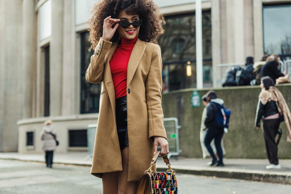
The colors on the Pantone autumn trend report showcase the ones that stood out at the respective fashion weeks of each city. Therefore, incorporating them into your wardrobe shouldn’t be too hard. Besides the usual creams, grays, browns, greens, and navy blues, we’re loving the optimistic pops of bright colors on both Pantone color palettes this year.
Since we’re fans of taking the sustainable route in fashion here at California.com, we recommend sticking to the core colors for the wardrobe staples and items you wear more often. This way, you won’t get bored with your trenchcoat and tote bag every time the season changes. Instead, interweave the Pantone fall colors into your wardrobe in a less obvious way. For example, a robust “Winery” scarf with a tasteful “Olive Branch” coat would look magnificent.
However, we wouldn’t want to discourage you from treating yourself either. Several of California’s best brands have put out beautiful fall and winter collections featuring the season’s Pantone colors and you should absolutely splurge if you love an item, especially if it comes from a sustainable business. The Brooklyn Dress in Lapis from Christy Dawn is identical to the Spring Lake color from the NYFW Pantone color palette. Need a new cozy sweater? The Madeline Turtleneck Crop Sweater on For Love and Lemons comes in the same shade of pink as “First Blush” on the London Fall Pantone palette. Similarly, bright and optimistic colors such as “Fuschia Fedora,” “Illuminating,” “Red Alert,” and “Daylily” could add pops of joy to your fall wardrobe.
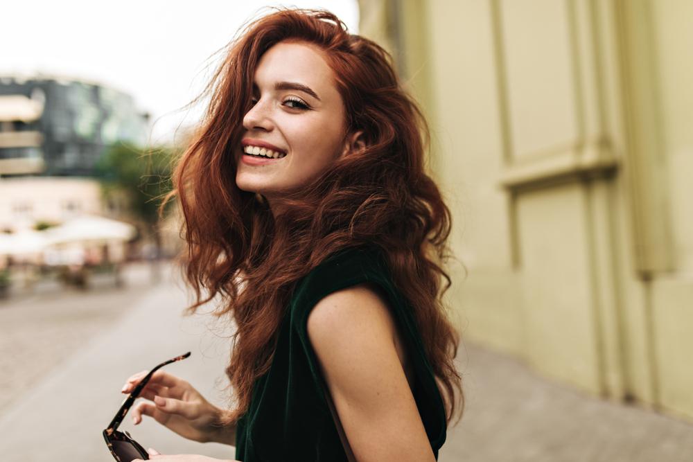
With autumn officially here, it's time to trade the no-makeup makeup looks, summery highlights, and bronzed glows for warmer hues more reminiscent of the season. Luckily, many of the Pantone fall colors allow for plenty of experimentation and enough variety to make things your own.
Deep reds are having a major comeback in hair trends this year. If you’re not afraid of bold and unnatural hair colors, “Winery” or“Fire Whirl” could look super cool, depending on what your stylist recommends that match best with your skin tone. Going the more natural route? “Root Beer,” “Adobe,” and “Downtown Brown” are all delicious browns on the Pantone autumn palette that’d look effortless in the colder months, but also carry you swiftly through the warmer months.
We’re sure we’re not alone when we say we look forward to the turn of the season to paint our nails in cool autumnal shades. A full set in “Olive branch,” “Root Beer,” and “Tomato Cream” would look beautiful. By simply looking at the Pantone fall colors on the screen, we’re imagining so many cool designs, accents, and pops you can do with the bolder and brighter colors on the palettes—the opportunities are endless.
You’re sure to find shades identical or similar to the Pantone colors from Los Angeles-based company Cote, which features endless rows of nail colors. The Fall Shades on Olive and June are also beautiful, so do take a look there as well.
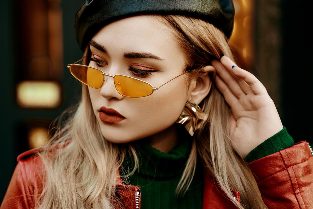
Unlike hair, makeup and nails require less commitment and allow for more room to experiment. Whether you’re trying something new and trendy or going for your tried-and-trusted autumn makeup routine, you can find a way to incorporate the Pantone fall colors into your look.
For eyes, we picture a graphic, Euphoria style liner in “Ibiza Blue” or “Clear Sky,” a shimmery pop of color on your inner corners in “Daylily,” or “Fuchsia Fedora,” or an underliner look in “Leprechaun” or “Rhodonite.” As for lips and face, “Pale Rosette” can be a pretty and pink blush color, while “Winery” would look beautiful as a glossy lip.
The Jaclyn Hill palette from California-based brand MORPHE features many shades, which are identical to the Pantone colors for fall and winter—imagine all the looks you can create!
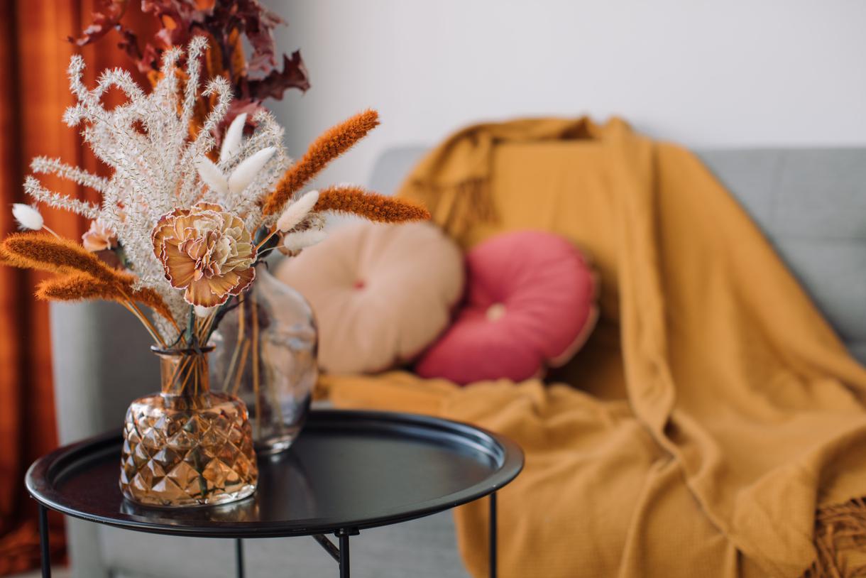
Home decor’s a whole different ball game when it comes to incorporating Pantone fall colors. First of all, it’s obvious that you won’t paint your walls, change your furniture, and re-do your house with the turn of the season because, by the time you’re done, a new trend report will already be out. Instead, you should try to embrace the fall color palette, look, and feel in more minimal ways that won’t make your house look like it’s decked out for Halloween.
Think pillows, candles, wall art, table lamps, and more small-scale details and accents that’ll succeed in both putting you in the mood for fall and tastefully revamping your house. Hit up California’s coolest furniture and decor brands and you’ll definitely find a piece or two that’ll elevate your space with your favorite Pantone colors.
Nothing warms up a room like a good carpet. Check out Tufenkian Carpets in Los Angeles and score yourself an Armenian rug in the warmest of Pantone fall colors. Something modern like Jackson II Firewood or a traditional rug like the Semi Antique Heriz are both amazing options and feature a combination of the Pantone fall colors. Cozy Teddy Faux Fur Pillows from Pottery Barn or a structural Goober Candle from Poketo are also great additions.
Additionally, the easiest way to add a little fall color and joy to your home is with seasonal flowers. Whether you’re growing your fall plants or buying them in bouquets, consult the Pantone colors to be on theme—California poppies are practically identical to “Daylily” on the London Pantone color palette!


Never been before? We’ll be your trustee Little Tokyo guide with a day’s worth of fun things to do in Little Tokyo.
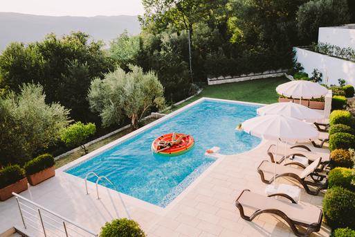
People go on Memorial Day weekend getaways as an indirect celebration of life. How do you plan on celebrating the long weekend?
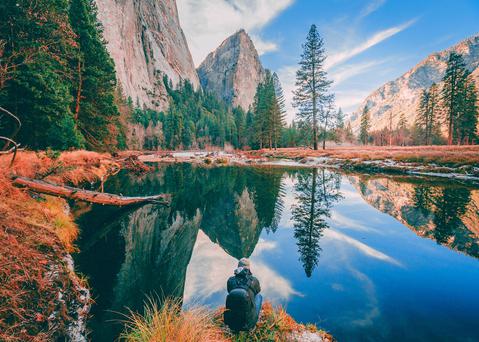
From undulating mountains, to coastal expanses, to verdant forests, here are some of the top spots for backpacking in California.
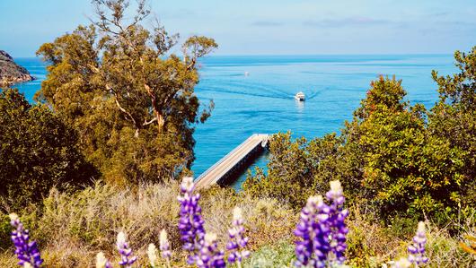
Settled off the California coast, the Channel Islands offer endless adventures. Here are the best things to do and how to get there.
